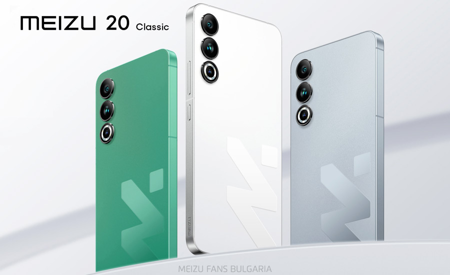
Yesterday started a pre-sale of Meizu 20 Classic, a new variant of Meizu 20 with a more youthful and modern design.
The Meizu 20 Classic comes in three colors – white, gray and green. In addition to the new colors, the graphic logo is located on the back of the phone, and the Meizu lettering has been moved to the side frame. The back panel is matte and the logo is glossy and reflects light differently depending on the angle of the phone. The white variant of the phone also has white display bezels.

The RAM has been increased to 16GB. The Meizu 20 Classic is available in 16GB/256GB and 16GB/512GB versions, priced in China at 3,099 and 3,399 yuan respectively. The other Meizu 20 Classic’s specs are the same as those of the Meizu 20.
Let’s recall that shortly before the Meizu 20 series’ release, the company presented its renewed logo, which is a combination of a graphic (MZ) and a letter image. Meizu 20 Classic emphasizes the graphic image. Is the aim to make this graphic logo more recognizable and will the new Meizu 21 series have a similar design?
 FAN CLUB BULGARIA
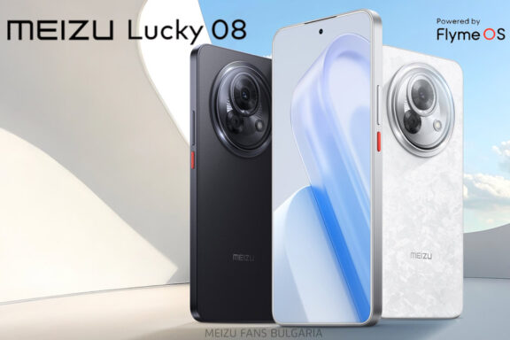
 Meizu Lucky 08: A budget AI phone with flagship features
 Meizu Lucky 08, most powerful AI phone in the 2,000 yuan range, will be released this month
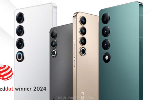
 Meizu 20, Meizu 20 PRO, Meizu 20 INFINITY and Meizu 21 PRO won Red Dot Award 2024